The Cost of Free Love and the Women Who Bore It
First published in Eye on Design Magazine, the Psych issue, August 2018. Magazine design by Shira Inbar
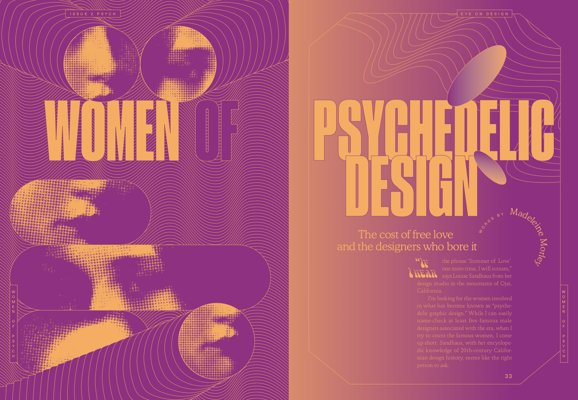
“If I hear the phrase ‘Summer of Love’ one more time, I will scream,” says Louise Sandhaus from her design studio in the mountains of Ojai, California.
I’m looking for the women involved in what has become known as “psychedelic graphic design.” While I can easily name-check at least five famous male designers associated with the era, when I try to count the famous women, I come up short. Sandhaus, with her encyclopedic knowledge of twentieth-century Californian design history, seems like the right person to ask.
“It was a period responsible for radical cultural change, and graphic design is of course part of that,” she says. “But there were things about it that weren’t so pretty.” When Joan Didion visited San Francisco’s Haight-Ashbury in 1967, she cooly observed the “desperate attempt of a handful of pathetically unequipped children to create a community in a social vacuum.” She saw five-year-olds on acid and spoke with women who, after being shunted from “entering the men’s talk,” found their “trip” in “keeping house and baking.” Does the same hold true for the women involved in the period’s design? I want to know where they are and how that Summer of Love might have filtered into their graphic work.
Rick Griffin, Alton Kelley, Victor Moscoso, Stanley Mouse, and Wes Wilson make up the aforementioned five men, known as the “Big Five,” said to be “responsible for designing the majority of the best San Francisco psychedelic posters in the 1960s.” Of this particular grouping, Sandhaus is skeptical.
“We have to keep in mind that many people become known through press,” she says. “Not to diminish their work at all—they were producing things that were prominent and recognizable. But to the degree that they then became known as the Big Five… I do wonder about that. The history of design can often be the history of publicity, promotion, journalism—whatever you want to call it—the design literature machine.”
In the prevailing history of psychedelic graphic design, the Big Five are the figures whose work and stories dominate the era. Their posters hang in galleries and are collected by major museums. Finding the names of the women involved in the period’s graphics, on the other hand, requires some significant digging; there are no eager publicists waiting for your phone call, no email addresses on websites or directories referring you to estates. The women I’ve spoken to for this article are the ones I’ve been able to surface, and only after following a veritable trail of breadcrumbs—many leads went cold, though, and countless stories remain deeply buried.
*
At one point, each of the Big Five was working on promotional material for rock concert promoter Bill Graham and his legendary Fillmore West venue in San Francisco. As word spread of the sudden cultural explosion taking place in Haight-Ashbury at the beginning of 1967, an estimated 100,000 young people descended upon the small neighborhood of just 25 blocks. Some would dub the months that followed the “Summer of Love.” Some women, like Didion, were far more dubious of the role consent played in all the loving. For the churning wheels of the design literature machine, it would become known as the climate that generated the classic swirling psychedelic print.

Bonnie Maclean. The Yardbirds, The Doors. 1967. Offset lithograph, 21 1/4 x 14″ (54 x 35.5 cm). Published by Bill Graham Presents, San Francisco. The Museum of Modern Art, New York.
By the time school was out for the year, promoters predicted that three million kids would show up to dance in the area’s venues. In response, Graham’s Fillmore West hurriedly prepared to stay open six nights a week, and it distributed alluring rainbow-colored posters across the country to entice America’s youth to head out West and join the party.
“Bill Graham tapped into the alternative lifestyle and values of the hippie movement centered on San Francisco,” says MoMA’s curator of modern design, Juliet Kinchin. “Posters were an important dimension of the psychedelic phenomenon, as were the light shows accompanying many musical acts promoted by Graham. Those reached their most ambitious and innovative form in 1967–1969, turning the concert hall into an immersive environment.”
The liquid light undulating across the venue’s walls and the dancing bodies was one of many inevitable influences of the “melting” typography that we now refer to as psychedelic. In 1965, the University of California, Berkeley also hosted exhibitions highlighting expressionist and art nouveau styles, which were attended by the type of artist we associate with psychedelia.
The best-known female designer of the era was Bonnie MacLean. She married Graham in 1967 and started out painting the venue’s noticeboards. When Wes Wilson and Graham fell out over money, MacLean stepped in to become the main poster designer for the Fillmore West, creating distinctive and flamboyant designs that played with letterforms and used striking, illusional patterns to trick the eye.
“She was in the right place at the right time, and clearly soaked up the scene happening around her,” says Kinchin. “In a sense, she and many other successful poster designers at the time didn’t need formal training; they learned on the job.”
The underground newspapers in San Francisco became another alternative space for would-be artists—they took advantage of cheap printing technologies to spread progressive ideas, and experimented with mimeograph machines to make them explode with color ink. Coupled with a rush of antiestablishment resistance and youthful energy, the new availability of the birth control pill and a growing feminist movement, there were new possibilities for women to get involved with forms of creative production that were previously less accessible.
“Like the advertising and printing industries at the time, the graphic design profession was male-dominated, and women were often required to give up their jobs if they married or had children,” says Kinchin. “But poster-making in the countercultural scene was less structured and formalized than in the leading commercial agencies. Women like MacLean found it relatively easy to slip into this kind of graphic design. But the whole phenomenon was relatively short-lived, and progressing to one of the established agencies or professions was altogether more difficult.”
I wanted to hear from those women contributing their artwork during that momentous year and a half or two; to see another picture of that time and its design, and to see what might have been.
*
In 1966, a few blocks from the Fillmore West, the steps of the neighborhood’s brightly painted Victorian houses were filled with hordes of young people wearing beads and bells, frock coats and velvet fringe—and holding the The Oracle of the City of San Francisco in their hands.
The Oracle published 12 issues between ’66 and ’68, with rainbow-print covers under the art direction of Michael Bowen. Editor Allen Cohen published beat poets Allen Ginsberg and Gary Snyder, as well as the artwork of Haight-Ashbury’s burgeoning artists. It was a local tabloid for what was happening, what was thought, and what was discovered, as minds under the influence bent in impossible directions.

Aspen, no. 9. front and back, 1970. Designed by Hetty MacLise. Edited by Angus and Hetty MacLise. The Letterform Archive, San Francisco
For the “The Aquarian Age” issue, medium and astrologer Rosalind Sharpe Wall devised a tarot deck, and writers predicted what was in store for the year. The cover was printed with The Oracle’s favored split-fountain (or rainbow roll) technique, which blended a spectrum of colors so they appeared to fade into one another like a Californian sunset. Beneath the masthead was a personification of the Aquarius zodiac sign drawn by the meticulous hand of underground comic artist (and Big Five member) Rick Griffin; the back cover depicted the counterpart, an angelic-looking female Aquarius drawn by his wife, Ida Griffin. The pair met in 1964 while studying at the Chouinard Art Institute (now the California Institute of the Arts). Ida continued to illustrate for underground newspapers until Rick’s career began to take off. Today, she manages her late husband’s estate. When I ask the galleries that have shown Rick’s work in recent years where to find her, I hit a dead end; the last anyone’s heard is she’s living in Hawaii.
Ami Magill was a staff artist at The Oracle, though lack of attribution makes it difficult to pinpoint her exact contributions. Magill worked closely with the paper’s longest-standing female designer, the late Hetty McGee, who has been described by friends as “a wild woman who danced with ribbons and lace” and brewed tea the prim English way, in a porcelain pot (she was from Liverpool). More often than not, McGee didn’t sign her Oracle illustrations. Many of the women contributing to the newspaper didn’t either, deciding to omit any authorship from compositions and to dedicate their designs to a muse that supposedly worked through them instead.
McGee was said to have lived with the Grateful Dead in their château recording studio in France. She also lived in New York for some time; a personal photograph taken by Andy Warhol shows her walking down the streets of Soho barefoot in purple taffeta and sunglasses, heavily pregnant, smiling with her husband, Angus MacLise—the drummer who quit the Velvet Underground when the band began to play for money.
Together, MacLise and McGee (who took his name when they married) edited the “Dreamweapon” issue of avant-garde multimedia artist magazine Aspen. Presented in a box, each issue focused on a different genre or scene—including conceptual, minimal, and pop—and invited a guest editor to curate and design the material. Steeped as they were in The Oracle and its surrounding culture, McGee and her husband were the natural choice for the psychedelia issue. McGee’s cover oozes an orange and pink landscape, and inside there’s photo-poetry and a sheet of stamps illustrated with brightly colored nudes.

Aspen, no. 9 1970. Box interior. Designed by Hetty MacLise. Edited by Angus and Hetty MacLise. The Letterform Archive, San Francisco
After time spent in Haight-Ashbury, the wife-and-husband duo traveled from Haiti to the Middle East and India, eventually moving to Kathmandu, Nepal. MacLise died young of hypoglycemia and tuberculosis, and McGee raised their newly born son, Ossian, in South Asia, returning to the UK later in life, where she earned a living doing phone readings for the Psychic Network.
*
The very first hippie clothing store appeared on Haight Street in 1966. It was called In Gear and founded by a man named Harry Tsvi Strauch (or just “Tsvi”). In Gear was where you went to find the beads, feathers, and paisley print that were The Oracle readers’ preferred accessories.
Tsvi helped form the Haight Independent Proprietors (HIP), which published notices scolding police for harassing the Haight’s new influx of residents; he was also one of many organizers behind the infamous Human Be-In. His wife, Hyla Deer, was credited in the San Francisco Chronicle with inventing “love beads.”
I get a tip that Tsvi is the person to talk to if you’re looking for connections, and my conversation with him is brief and to the point. “Everyone always thinks the ’60s were a guy thing—not so. There were some important women drug dealers, too.”
Tsvi gives me the number of the graphic artist Mari Tepper, who worked at In Gear for a short period and contributed art to The Oracle. Before moving to the Haight in ’66, Tepper grew up nearby with her mother and three brothers. She began designing gig advertisements for Bill Graham as a teenager. Her style is unique: detailed compositions feature elongated and expressive bodies informed by Egon Schiele’s twisted figures, as well as the intricacies of Friedensreich Hundertwasser and Gustav Klimt. Tepper’s father, Gene Tepper—a well-regarded industrial designer immersed in ’50s functionalism—taught his daughter certain principles that she combined with the youthful dynamism brewing around her. Tepper’s mother was one of the first women to study painting at Yale’s School of Art; she put her young daughter in contact with political organizations in the mid-1960s, such as political performance group the San Francisco Mime Troupe. It was Tepper’s poster for the improvisational comedy collective The Committee that first caught Graham’s eye and landed her the gig designing promotional material for Janis Joplin’s Big Brother and the Grateful Dead. At the time, though, these names were unknown—just local kids in the Haight with a new kind of sound.
“Graham liked my work, so he became my first boss,” Tepper tells me. “I had a great experience with him. Around that time in 1966, I also had my earliest shows—one at the Psychedelic Shop and the other at the Print Mint.” Tepper received a scholarship to the Academy of Arts in the summer of ’65, during which she honed her craft. It was while working with Graham that the Big Five’s Wes Wilson taught her how to put together a poster for printing.
Tepper has always identified as a feminist, and from an early age she stood with her mother at the front of picket lines in solidarity with the civil rights movement. She’s fixated on depicting groups of people in her posters: expressive figures hold hands, dance, or stand together in a united line. Living in the Haight as a young woman, she felt more like a “beatnik than a hippie” compelled by a sense of social responsibility and committed to social and structural change. It was the giving, anti-money ideology of the Diggers community-action group that especially caught her imagination from the moment that they appeared in ’66, dishing out free food in the Golden Gate Park.
Although it’s typically attributed to the Grateful Dead, it was at the Free Store that the Diggers women first introduced tie-dye to the American youth. One day, when the shop was overstocked with uptight white button-down Oxford shirts that no one wanted to wear, the women gave them new life by knotting the fabric together and dipping them into dye. Not long afterward, the new look was everywhere.
In the Free Store’s garden, among the buckets of suds, white shirts, and rainbow water, Tepper painted the legendary oversized door frame for the Diggers, which became known as “the free frame of reference.” This door shows up in nearly every historical account of Haight-Ashbury, though Tepper’s name almost never accompanies it. If you wanted a plate of free food at one of the group’s events, you’d have to step through the frame, which Tepper adorned with the words “A Magic Theatre for Madmen Only. One Who Enters, Forever Lonely” in her characteristic free-flowing script.
“There was a lot of very magical stuff going on,” says Tepper. “But I wasn’t happy with a lot of things taking place, like when the Hells Angels came into the Haight in late ’67 and brought in speed and all kinds of other freaky stuff. At the time, being a woman was not as fun as being a man. The ‘make love not war’ thing was taken very literally.”
*
It’s within this energetic and tumultuous period that young Tepper began making posters for the American Newsrepeat Company. “I was asked to do a poster about birth control pills, which had only been out for maybe six years at that point, and I was taking them,” she recalls. The pills appear in the center of the poster’s composition in their typical round container, and “tantric figures” stem from them to form a star. “I was using luma dyes, which had these brilliant colors, and I hand painted the whole thing with brushes.”

Mari Tepper. Hallelujah the Pill. 1967. 22 x 22″ (55.9 x 55.9 cm) Published by American Newsrepeat Co. © Mari Tepper. Courtesy of the artist.
Tepper designed it on the floor of her first apartment in the Haight, which she shared with her roommate, an emancipated minor who was 16. One day, her roommate’s boyfriend, a guy by the name of Bobby Beausoleil, was over while she was painting. “It turned out he was one of the Manson guys,” she says. “It was my roommate’s first boyfriend and he started talking to me about how he wanted to bring her back to his family.” Luckily, she didn’t go.
Tepper found Beausoleil as mesmerizing as he was disconcerting, standing over her while she worked. “I was sitting on the floor doing this poster, which was very erotic, so it made me feel quite vulnerable,” she says. “I was so naïve, I didn’t know about these things, but he tried to seduce me.” Tepper wasn’t interested, and she turned him away.
Her triumphant design, one of her most successful, celebrates women’s liberation and newfound sexual freedoms with glorious exuberance, but it’s significant that it was produced during a moment of vulnerability. While the snakes could represent Eve, they could also denote the shadows of a dark side of the Summer of Love and all its new, uncertain forms of negotiation. They signify a sense of precaution in the midst of colorful discovery, especially during a moment when the exploitation of the young was rampant, as the world opened to uncharted and alternative ways of being. “Now with the #MeToo movement, I think things are really going to change, you know?” says Tepper.
Both Tepper’s “Hallelujah the Pill,” and another for American Newsrepeat, “God Grows His Own,” likely sold over 60,000 copies in the ’60s, but Tepper never got paid for them. The systematic exploitation of her work has been unrelenting ever since, with continual copyright infringements and numerous instances where she has either been underpaid or not paid at all. She realizes that those who reaped the historical and financial benefits from the period’s infamous graphic art are mostly the “straight, white men” who were around. She tells me she’s not embittered; rather, she’s politicized.
In ’68, Tepper fell for a young man in her building who “looked just like George Harrison.” He had an LSD vision that beckoned him to “move to the country and stop doing drugs,” so Tepper packed up and went with him to New Mexico. Before they left, though, he told her that if she wanted to be with him she needed to get rid of her artwork, so Tepper threw away her prints. It’s a similar story to the one Joan Didion tells; her Haight women were also dissuaded from their creative pursuits by men.
“Poster design just felt like something that I was doing. You don’t realize that it’s going to have value later in life,” says Tepper.
*
In 1967, over 5,000 miles away from the Haight, something similar yet altogether different was occurring—connected in spirit and appearance, but with a life of its own.
In a basement flat in Notting Hill Gate, West London, not as swish an area as now, three Australians—editors Richard Neville and Jim Anderson, along with graphic designer Martin Sharp—began publishing the UK edition of the infamous underground paper Oz, which by 1971 would be the subject of the longest obscenity trial in British history. Alongside energized writing by Germaine Greer and misogynistic comics by Robert Crumb were dazzling wraparound and pull-out posters, unexpected use of color, and trippy compositions, making Oz stand out like a firework against a gray, industrial post-war Britain. Its libertarian tinge and blunt, obliviously sexist content rightly deterred and riled London’s growing feminist movement, but it also became a celebrated space for pioneering writing on gay liberation, the politics of sex and drugs, music, and anti–Vietnam War sentiment.

Oz, no. 8. 1968. Cover designed by Virginia Clive-Smith and John Goodchild. The Letterform Archive, San Francisco
The only woman listed under “design” on the staff was Virginia Clive-Smith. Oz was Britain’s most celebrated graphic response to spiraling psychedelic influences, and Clive-Smith sat in the heart of it with her scalpel and metal ruler, putting all the elusive pieces together. She often went uncredited on the issues she designed, though. “I mean, I was a girl,” she says.
Clive-Smith also went on to work for Sir Terence Conran on the graphics for the interior design store Habitat, and for Rolling Stone in London and in San Francisco, as well as Island Records. She lived for some time in Notting Hill in a small studio apartment with a yellow canary that would sing along to the record player. “Life rolled so quickly then,” she tells me. She’s lively in conversation, with a bright and undiminished rebellious attitude.
During the ’60s, Clive-Smith was at art school with designer John Goodchild, who would later bring her to Oz. He was a few years ahead of her at school and became “a sort of mentor.” They shared a flat on London’s Old Brompton Road, and the pair first began experimenting with layout for an underground newspaper called Image. It was while working on Image that Clive-Smith, a gifted typographer, first became aware of Allen Ginsberg, and the rhythm of his poems began to influence the rhythm of her design work. “That playfulness of Image then went on into Oz,” she says. “But of course we also had the inspiration of brilliant Martin Sharp.”
Clad in a uniform of mismatched ski pants and a backward V-neck men’s sweater, Clive-Smith poured what she saw and what she felt into editorial layout, and especially into type treatments. “The thing is, everything was changing terribly rapidly, and all these young people from around the world were arriving in London. Somehow the whole deck of cards had been thrown up in the air and was coming down in a new order.
“I’d been trained in a way that was Bauhaus-inspired. Grids and all that. When all the playfulness came in, it sort of got overlaid on top of the grids. I started to realize I could use lettering to illustrate a feeling, and that was… well, it was very, very thrilling.”

Virginia Clive-Smith’s notebook, showing a sketch for the Oz masthead. Courtesy of the artist.
One of her credited designs for Oz, a cover made together with Goodchild in editor Neville’s maisonette flat, combined pop graphics from Marvel comics with exuberant DayGlo ink that would become the magazine’s staple, a material bought at industrial stores where it was intended for road signs. For her 1968 cover, Clive-Smith drew from the light shows at London nightclubs to create a melting, vivid typography spelling out the magazine’s name. The team was aware of what was going on in the Haight, too, as tubes filled with San Francisco’s music posters found their way to London.

Oz, no. 1. Cover featuring masthead designed by Virginia Clive-Smith.
Around the same time, Clive-Smith began working at The Conran Design Group and as a fiery young freelancer, she didn’t stand for disrespectful, patriarchal behavior from her superiors. While she admits being in awe of the “inspirational and fantastic” Conran, she recalls how one day he came into the office and sweepingly marked a giant red X over a design that Clive-Smith had labored over for weeks. She didn’t hide her anger, and instead ran to the bathroom to violently kick at its door.
“He never treated me like that again,” she says. “He knew that when I was kicking the door, I was actually kicking him.”
In 1970, Clive-Smith joined Goodchild at Rolling Stone in San Francisco for 18 months; they’d been working for the magazine in London, adding British plates to the American content for the UK edition. “It was completely different in San Francisco; it was a much bigger setup and was ruled with a rod of iron. [Cofounder and publisher] Jann Wenner was more like Conrad than Neville, in that he was building an empire. There wasn’t any mucking about. I did nearly get sacked from Rolling Stone because it was pretty serious.”
That seriousness felt stifling to free-spirited Clive-Smith. By that time, the frenzy of Haight-Ashbury had begun to fade, or rather, the culture around it had rapidly commercialized. Clive-Smith became close with Cindy Ehrlich, another female graphic designer at the magazine, and was in awe of “brilliant” Annie Leibovitz whenever she came into the office. After returning to London, she remained freelance, which gave her a liberating sense of both “freedom and control.”
*
If thousands of young women flocked to the Haight in ’67, and even more opened their minds in countless cities and towns across the world—with bright ink and new print mechanics at their fingertips—who knows how many posters and prints got tossed into dumpsters without a second thought? The year 1967 sometimes felt turbulent and dangerous, the edge of something edgy, but for a brief and wonderfully strange moment, for women who happened to be in the right room in front of the right printing press at the right time, there was also a sense of possibilities.