Marguerita Mergentime Literally Brought Modernism to the Table in America

Sixty years ago at the Golden Gate International Exposition in San Francisco, a curious wall hanging in the fair’s decorative arts exhibition caused an unexpected stir. Crowds gathered underneath it, chuckling to themselves or debating with one another over the words printed on the silk-screened fabric. The unusual show-stopper was made by a woman named Marguerita Mergentime, a self-trained New York City designer whose known work consisted mainly of table linens, and yet here she was, alongside tapestries and textiles by the world’s foremost designers.
Measuring nine feet long and nearly five feet wide, “Americana” is composed not of visual patterns but of 360 phrases culled from American culture and politics, all densely set together in alternating sections of bold Futura capitals followed by rows of elaborate cursive. “Coca-Cola,” “clam chowder” “Boston baked beans,” “jaywalkers,” “free speech,” “state university,” “Republicans,” “Democrats,” “Glamor Girls”—whether you love a phrase or hate it, there’s something you’ll recognize and respond to amongst the poetic jumble of red, white, and blue.
“The piece is really a snapshot of America in 1939,” says Virginia Bayer, the granddaughter of Mergentime, who only discovered the full extent of her grandmother’s extensive output after unearthing her textiles, articles, and papers when her mother passed away. “You’d have to take hundreds of photographs to encompass what she put in there—from food, to politics, movie stars, sports games, and slang.”
“Americana” was such a hit and drew such large crowds that it caused traffic jams at the fair; eventually it had to be moved to a wall of its own. To see modern type on a huge hanging textile was unprecedented at the time. Rooted in the lineage of commemorative quilts (which also often contain words), the design of “Americana” stood apart in that it conveyed a uniquely modern American experience. The loud shock of type and color referenced the attention-grabbing quality of words on cinema marquees and Times Square billboards; and its appropriation of slang referenced the whimsical writing of Gertrude Stein, or even the expansive poetry of Walt Whitman. Who was the designer behind this extraordinary hanging? And what was she doing creating typographic compositions during this particular moment in American industrial design history?
★
Mergentime was born in 1894 on the Upper West Side to a prosperous German-Jewish shipping family that had been in America for several decades. Her personal wardrobe was sleek, stylish, and elaborate; elegant turbans in black and gold and chunky lime green knit sweaters flown in from Paris were closet staples. She was an intellectual, hungry for ideas; a book collector, an avid gardener, and an amateur photographer, but she was especially switched-on when it came to modern design. In the early 1930s she commissioned well-known architect Frederick Kiesler to create the interior of her duplex on Central Park West. He lined the white-walled apartment with stainless steel, aluminium, and glass furniture, and placed a Le Corbusier chair along with two show-stopping leather sofas—one red and one white—in the center of the living room. When Virginia Bayer’s father married Mergentime’s daughter Molly, he likened the experience of walking into the apartment to landing on the moon.

Marguerita Mergentime at work on fabric design for Radio City Music Hall, ca. 1932
Cool steel, aluminium, and glass need the soft homeiness of textiles to warm the space, but accessories to suit the minimal Keisler interior were difficult to come by. “When my grandmother tried to find a tablecloth for her new home, she couldn’t,” says Bayer. “She was frustrated at not being able to find anything that fit with her sensibility. So she decided to make them herself.”
Recognizing this gap in the market, Mergentime set out to seriously pursue the design of modern table linen. By this time, she was already a wife with two daughters, so she enrolled in art classes at night and frequented the Metropolitan Museum after dropping her children off at school, in order to study the collection’s antiques and fabrics. “When she created her first collection, she had to work very hard to convince a manufacturer to produce it,” says Bayer. “At the time, tablecloths tended to be white or pastel.” Mergentime designed cloths with bold shapes and positive colors and messages; she garnered attention and success, and so continued to produce more and more. America was recovering from the Great Crash of 1929, and life had been very hard. “My grandmother was not only bringing modern design to the table, but also uplifting messages and color into the home.”
Mergentime borrowed phrases from Gertrude Stein’s opera Four Saints in Three Acts (1928) for the titles of her first irregularly patterned linen collection in 1934; there was the playful orange-and-lime checkered “Have to Have,” as well as the light caramel and chocolate brown “Instead Of.” The latter did exactly what its name suggested: it enticed women to arrange their tables around the sharp line of its geometric L instead of across a tired pastel pink sheet. When it it was draped, “Instead Of” refuted conventional ideas of how to properly set a table, as a hostess could reimagine how plates, saucers, glasses, and cutlery might fit in with its off-kilter design. In many ways, Mergentime’s products were a kind of collaboration: She provided the backdrop, and then a hostess used her own creative license to complete the scene.

Marguerita Mergentime, “Instead Of,” 1934
★
Mergentime steadily made a name for herself at a time when it was rare for kitchenware designers to obtain recognition. Consumers and critics alike loved her linens; her work was lauded in the pages of women’s magazines as well as The New Yorker. “In the 1910s, there was a big movement in America towards finding a style of American decorative arts that wasn’t Eurocentric,” says textile historian Donna Ghelerter, editor of Marguerita Mergentime: American Textiles, Modern Ideas. “Mergentime was looking towards folk art and Americana for inspiration, and she brought that into her linens.” Her “American Antiques” (1939) cloth featured illustrations of a range of antique objects (probably inspired by what Mergentime studied at the Met) and it invited guests to count how many of the objects on the linen they could name.

Marguerita Mergentime, “Food for Thought,” 1936
Apart from the bright geometry of her designs and their uniquely American references, there was something especially unusual that placed Mergentime apart from others. Her tablecloths were not only meant to brighten and enliven a space, they were intended to spark conversation and help a hostess entertain her guests. As with “American Antiques,” “Milky Way” (1939)—a deep blue cloth speckled with white stars—enticed the amateur astronomer to trace constellations across the table with their finger tips. At one point, Mergentime referred to her cloths as both “gustatory and guestatory.”
“She was a wife, a mother, and she of course threw dinner parties herself,” says Bayer. “She knew that a hostess didn’t just supply the food and the setting but also the conversation. And she didn’t want a boring dinner party. So she designed her linens to be the stimulus for engaging table conversation.” And not only did they spark conversation, her products actively transformed the domestic space of the dining room table—the sphere of the kaffeeklatsch—into a place of trivia, of knowledge exchange, of geographic and historical fact-finding. They took a feminized space of decoration and domesticity, and interpreted it not as a site of frivolity, but as one for communication and intellectual stimulation.
The illustrations were one device Mergentime used to inspire conversation, and her approach to typography was perhaps even more distinctive. “Food Quiz” (1939) featured questions about American politics and popular food printed across a square cloth in four directions. Answers to questions were printed on opposite sides of the cloth, so that dinner guests would have to work together. A variety of different typefaces, mostly rendered in capital letters, scatter across the design like a collage.

Marguerita Mergentime, “Food Quiz,” 1939
“Mergentime was a modernist in her use of color and asymmetry,” says historian and designer Linda Florio, who has written extensively on Mergentime’s use of type. “But when it came to type, she didn’t have the educational background to be strict about it. She’d been to lectures by European type designers in New York, so she knew of Futura. And she’d also bring in other typefaces she saw around her.”
Mergentime clearly saw typography as an expression of the American modern moment—it represented the graphic cacophony she saw around her every day. The first instance of Mergentime using type on a tablecloth was as part of a collection she designed for the department store Lord & Taylor called 100 Years of American Design, which included linens to represent three different periods of American history. Quilt motifs and ribbons, lace and floral chintzes, as well as old-fashioned school houses appeared on her 19th-century themed work. “Food for Thought” represented the modern period: it’s a simple design with a small star at its center surrounded by political speak and slogans, like “Votes for Women,” “Social Security,” “The War to End War,” and “Socialists.” Rendered in a variety of typefaces, the linens provided guests with talking points for discussion and debate. “By using this as her modern entry, she clearly saw words as a seminal example of the era,” says Bayer.
“There was text on other kitchen textiles at the time and prior,” adds Ghelerter. “But text on a table linen—as ‘conversation at the table’— Mergentime was definitely innovative in that.”
A booklet written by Mergentime accompanied “Food for Thought” to help guests define the various words on the cloth, and she jokingly—or perhaps not so jokingly—predicted that the design would “separate families, sever old friendships, and create havoc.” A series of blue, red, and green cocktail napkins entitled “Here’s How” were her second modern entry in the 100 Years collection. Entirely text-based as well, each napkin included three toasting expressions written in different languages, such as “salud,” “skaal,” and “cheerio.” Various typefaces stand in for different languages; for Mergentime, not only did type represent the written words of her modern everyday, but also the multiplicity of languages and voices surrounding her in a country with a long history of immigration and cultural exchange.

Marguerita Mergentime, “Milky Way,” 1939
★
It was in 1938 when Mergentime received a studio visit from the prominent textile designer Dorothy Liebes; she was directing the Golden Gate International Exposition’s 1939 decorative arts exhibit, and she had her eye on Mergentime as a contributor. Prominent names such as Duncan Grant, Ben Nicholson, and Pola Stout were exhibiting their textiles, and tapestries with designs by Man Ray, Henri Matisse, and Pablo Picasso were also to be included.
When Liebes invited her to be part of this group, Mergentime says she “gasped and murmured something like ‘yes.’ Here was I to design a textile to hang with the greatest designers.” The thought of all their revered work and accomplishments haunted Mergentime week to week as she tried to design her contribution to the fair, but then suddenly a flash came. “What could I do that they could not? That was more like it…. Surely life today in the U.S.A. That’s it!”
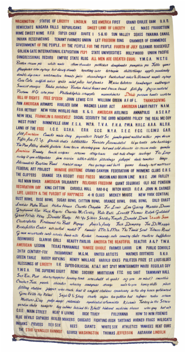
Marguerita Mergentime, “Americana,” 1939. Rayon, cotton. 123 × 54 in.
Brooklyn Museum, gift of
Charles B. Mergentime
After her flash-bulb realization, Mergentime began work on “Americana.” “The question that she asked herself is a wonderful question for anyone trying to do something original,” says Bayer. “Rather than being afraid of competing with the greats, she looked within herself to see what she had to offer that would stand alongside what they did.”
As a lover of words and research, Mergentime began her design by collecting Americanisms into a long list of 1,000 phrases that she whittled down to her final 360. She screen-printed them on white fabric by an American manufacturer, first laying out her paste-up before working out which to print in blue and which to highlight in red. The red highlights therefore don’t form a regular pattern, but instead seem random. “The red stands for the values of America—who America is, what it stands for,” says Bayer.
Mergentime’s hanging is difficult to place historically. It isn’t purely modernist: it’s not strict or formally tight, but it’s still laced with modern type and it exudes a knowledge of international modernism in its simplicity and near-justified form. It includes wisps of nostalgia, with its cursive type, and it clearly sits in that pre-war moment in industrial design when America was looking towards its own history to find a national design expression. Its maker’s love of literature and word play is blatant; its appropriations of pop culture predate a visual vocabulary soon to come; and it’s aware of the domestic language of American quilt-making, which Mergentime updated to suit her own modern period. The textile’s handmade inconsistencies and imperfections proudly situate the work in a long lineage of work by self-trained women, who had commemorated their own histories and ideas through needle and stitch for centuries.
“Americana” was ultimately a mixture of all the things that Mergentime held close to her and deemed important, and it was her last great hit before she was diagnosed with leukemia in 1941. She died a few months later, at the age of 47. “She took a modernism that was very rigid and straightforward, and give it her own flair. That was her genius to me,” says Florio. “Her sense of design, her love for language, for typography, and for textile—it’s all there in one hanging,” says Ghelerter. “Just think what she would have done had she lived, because she did so much in such a short period of time.”
With her elegant designer wardrobe, her aluminium bookshelf stocked with antique tomes, her regular attendance at craft and type lectures, her keen curiosity, and her love of travelling the continent, Mergentime was quilting together her own interests and bringing them all to the table with her. She neatly answered the question of where she sourced her unusual ideas from during a 1940 talk at Skidmore College: “The best way to get ideas is to be interested in ideas.”